Our brief for this project was to create ‘an iconic statement which would also combine high levels of sustainable and environmental design’.
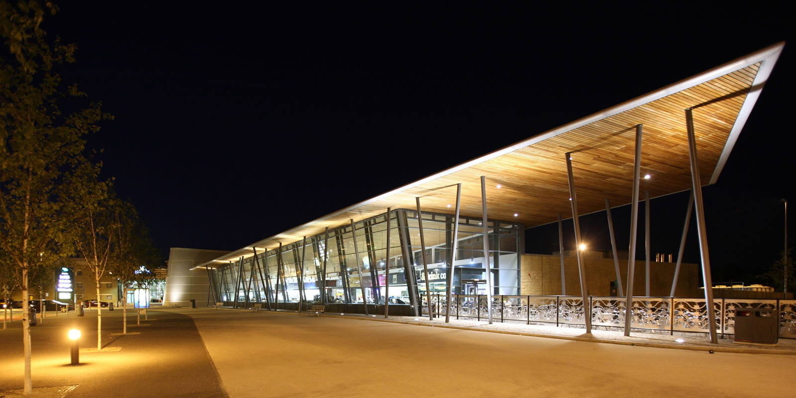
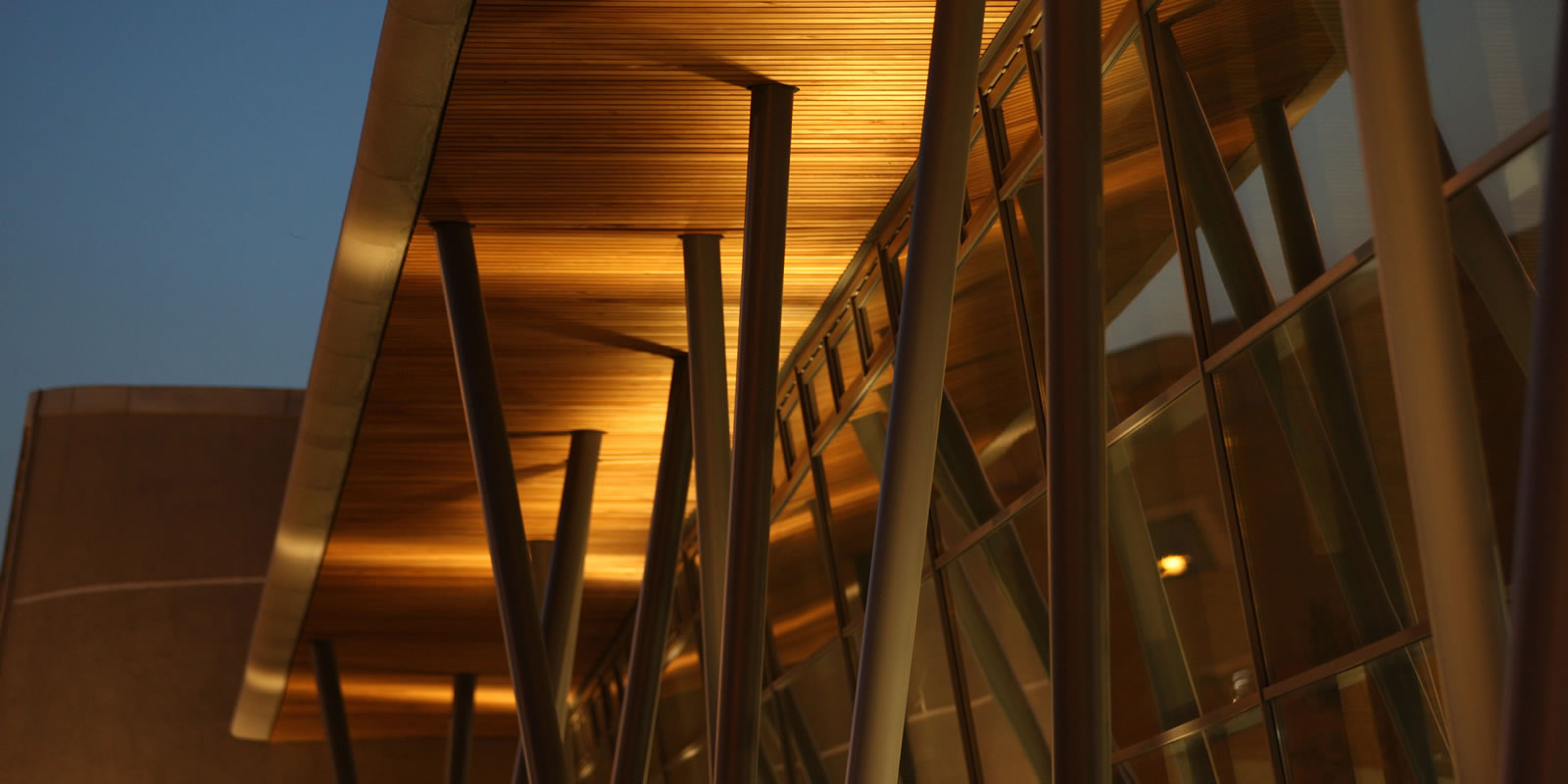
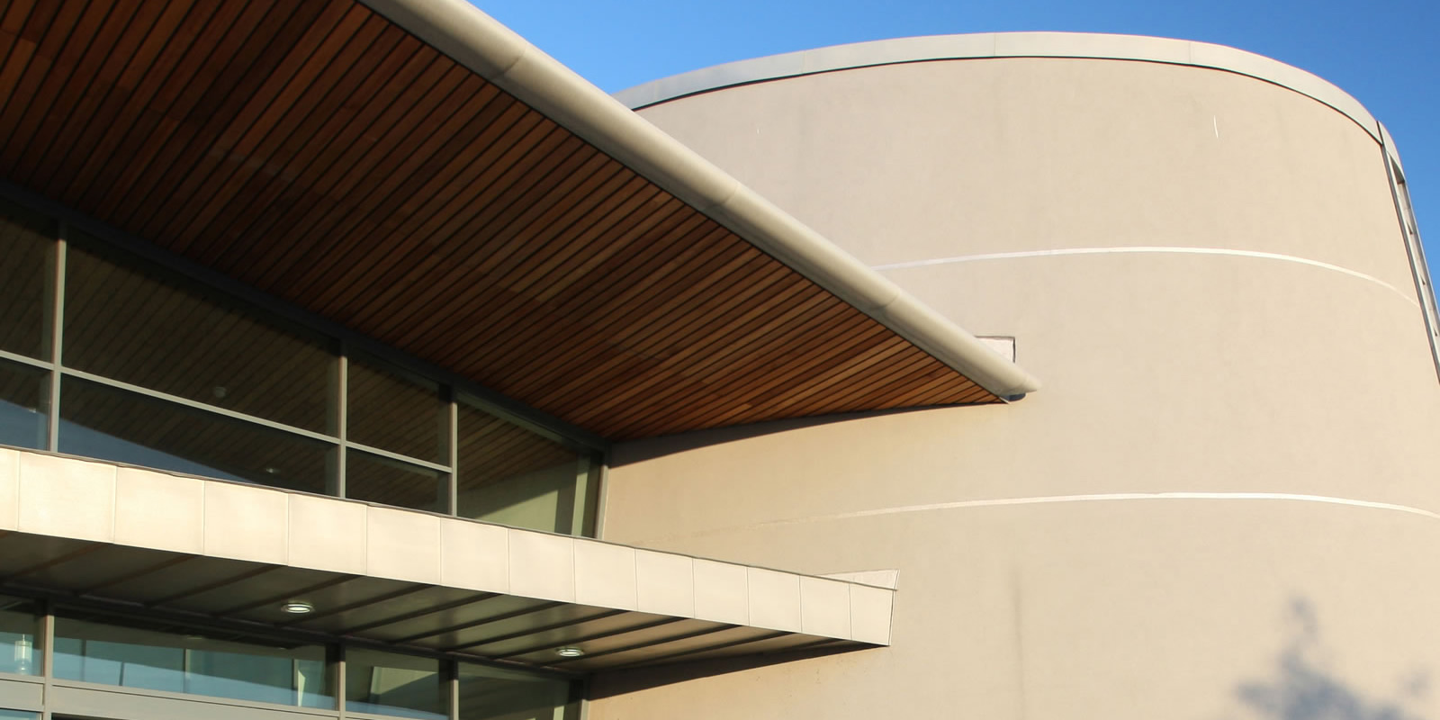
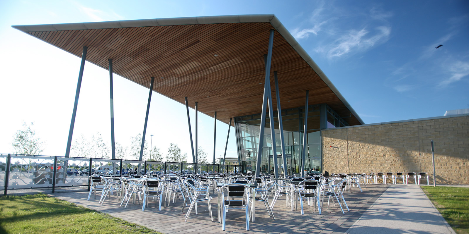
Being in open countryside meant that the building had to maintain a relatively low height profile, so we designed dramatic over-sailing wing profile roofs to create a horizontal emphasis. Supporting them on a series of irregularly spaced and angled columns also enabled us to create a sense of structural drama.
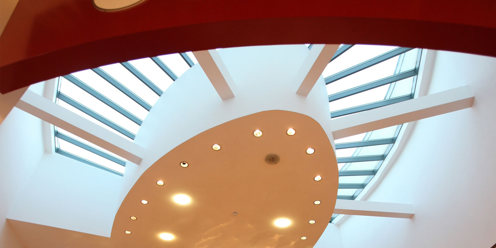
A central rotunda identifies the entry point into the building. An inclined glass wall naturally ventilates the building monitoring wind pressure and temperatures. The back up heating and cooling system uses ground source heat pumps and thermal mass floor slabs, which are utilised when temperatures within the building go beyond acceptable parameters. And with the addition of grey water recycling and SUDS drainage systems we more than fulfilled the sustainable element of our brief, with the client reporting 20% savings compared to more conventional buildings within their estate.
The interior of the amenity building involved careful selection of finishes. The orientation of floor finishes and thresholds in the main concourse serve to guide visitors along the various offers.
Their scale is commensurate with the volume of the building and colours appear to flow through the curtain wall seamlessly into the defensive hard landscaping at the front of the building. All the time remaining neutral and allowing the shop fronts of the retail offers to take centre stage.
Timber slats bathe the seating area with warm indirect light and also serve to take care of acoustic issues normally associated with large expanses of hard finishes.